
• Design System Architect
• UI/UX Designer
• Product Designer
• Developer Collaboration
SalesAi was growing quickly as a SaaS platform, but the product experience needed a stronger foundation. The interface had useful patterns, but they were not yet organized into a scalable system that designers and developers could consistently rely on.I created Mint, a design system built to bring structure, accessibility, brand alignment, and developer clarity to the SalesAi product experience.
Before Mint, the product had inconsistencies across spacing, colors, component structure, and accessibility. There was no complete token system, Figma and Storybook were not fully aligned, and the product UI did not always reflect the newer SalesAi brand direction. This created design debt and slowed down both design and development. Designers had to recreate or reinterpret interface patterns, while developers had to make judgment calls without a single shared source of truth.
I built Mint as a scalable, developer-focused design system for SalesAi. The system introduced a cleaner visual language, a primitive-to-semantic token structure, reusable components, stronger accessibility defaults, and clearer alignment between Figma and Storybook. Mint gave the product team a shared foundation for designing and building faster while making the interface feel more cohesive, polished, and on-brand.


Before jumping into components, I looked at the existing SalesAi product UI, brand direction, and product workflows to understand where inconsistency was showing up most often. A few issues became clear quickly:
• Spacing and color decisions were inconsistent across screens
• There was no clear primitive or semantic token structure
• Accessibility patterns needed more deliberate defaults
• Figma and Storybook were not aligned closely enough
• Some product UI patterns no longer matched the SalesAi brand
The goal was not just to make the interface look better. It was to create a system that could scale with the product and make day-to-day work easier for both designers and developers.
I structured Mint around a clear foundation-first approach. Instead of starting with large page-level patterns, I began with the smallest reusable decisions and built upward from there.
The system was organized around:
1. Design tokens: color, typography, spacing, radius, and padding
2. Components: reusable interface elements built from those tokens
3. Documentation: usage guidance, examples, and component behavior
4. Developer alignment: naming conventions and Storybook integration
5. Product examples: real screens showing the system in context
This structure made Mint easier to understand, easier to maintain, and easier to translate into code.
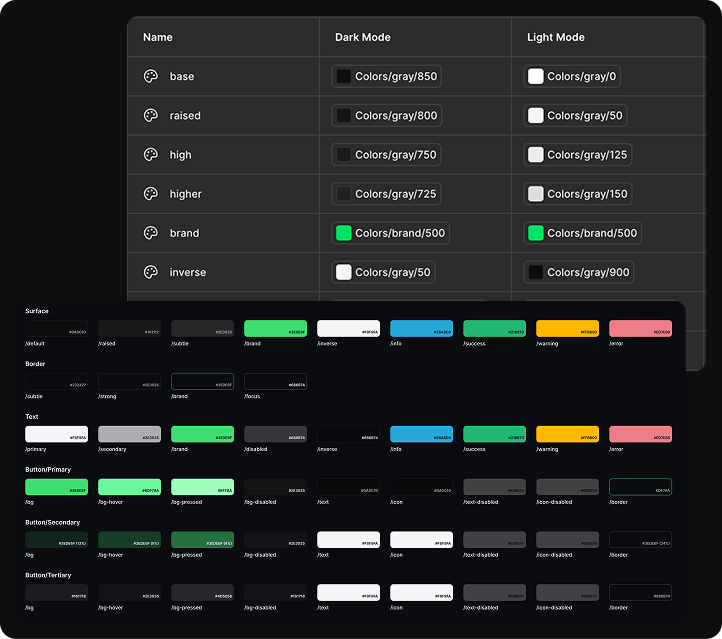
I started with the backbone of the system: design tokens.
Mint needed more than a set of nice colors. It needed a scalable token structure that could support real product states, accessibility requirements, light and dark modes, and future product growth.
I built the token system in layers:
• Primitive color bank
• Semantic color mapping
• Typography
• Spacing, radius, and padding
The primitive color bank gave the system a stable foundation. Semantic mapping then made those colors useful in product design by tying them to actual interface meaning, such as backgrounds, text, borders, actions, and states.
This made the system more flexible. If the brand evolved or a color needed adjustment, the product could be updated from the token layer instead of manually changing every individual component.
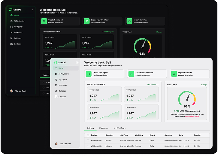
Accessibility was built into Mint from the beginning rather than treated as a final QA step.
I focused on contrast ratios, focus states, and light and dark mode options so that accessible decisions were embedded directly into the system. This helped reduce one-off fixes and made it easier for designers and developers to make good choices by default.
The goal was simple: if someone used the system correctly, the accessible option should already be the easiest option.
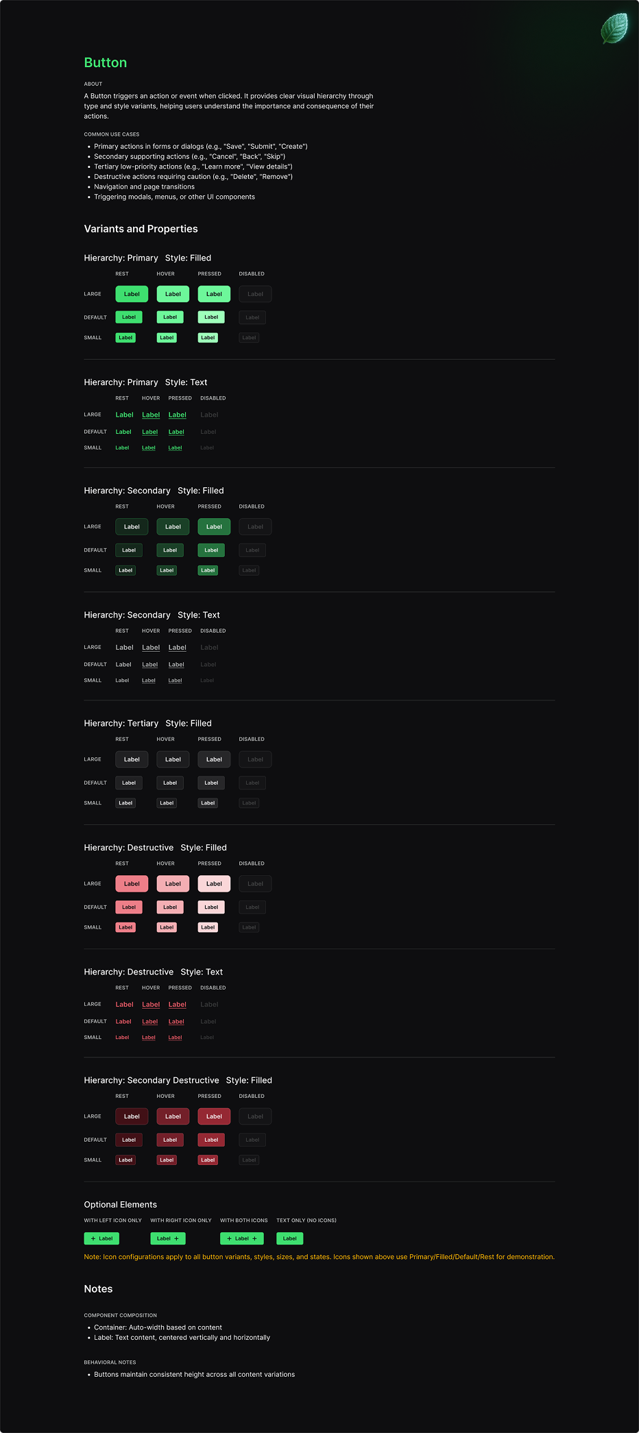
Once the token foundation was in place, I moved into components.
I built components with an atomic mindset, focusing on structure, consistency, documentation, and real examples. Each component needed to be flexible enough for product work but constrained enough to prevent unnecessary variation.
The component system included detailed documentation and usage examples so designers could understand not just what a component looked like, but when and how to use it.
This helped reduce guesswork and made Mint feel less like a static UI kit and more like a working product system.
A design system only works if it helps both design and engineering. For Mint, developer alignment was a core part of the process.
I focused on clear communication, naming alignment, and Storybook integration so the design system could become a shared language between Figma and code.
That meant component names, token names, and usage patterns needed to make sense to both designers and developers. The closer Figma and Storybook stayed to each other, the less time the team had to spend translating design intent into implementation details.
Mint gave SalesAi a stronger product foundation.
It reduced design debt, improved consistency, aligned the product more closely with the brand, and created a shared language between design and development. Most importantly, it gave the team more time to focus on user experience instead of repeatedly solving the same UI problems.
The system was built to keep evolving. As the product grows, Mint gives SalesAi the structure to move faster without sacrificing quality.